Most of the existing desktop operating systems have browsers, which allow us to browse a web page conveniently. However, the original mobile browsers were difficult to access the web, because their low resolution, small screen and browser did not support many cutting-edge CSS and JavaScript, making them incapable of accessing the desktop version of the website. At that time, the websites accessed by mobile phones were greatly simplified versions specially designed for the device, like this:

That all changed a lot, though, until the release of the iPhone. Because the browser on iPhone - Safari is a real and very cutting edge web browser and it also supports HTML5 standard. It comes with almost the same browser as a computer - so much so that it supports CSS3 and JavaScript. But all this is displayed on a device that is only 320 pixels wide. However when a desktop browser is reduced to 320 pixels in width, it becomes very different, when he visits a web page that is not optimized for it, it will scale it (the width will be scaled to 1/3), Take Baidu News as an example, if there is no adaptation, the computer version of the website will be displayed, so that the words on the page will be small, but the user can solve it by zooming, so there is no problem. However, Baidu News made a version specifically for the iPhone, like this:

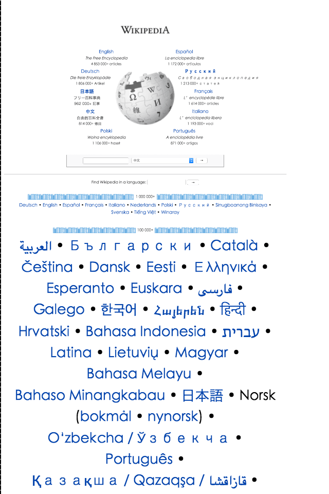
It adapts better to touchscreens and doesn’t have the problem of small fonts or scaling. But please note that this page is no longer the page just now, which means that Baidu needs to redesign a webpage for the iPhone version, which is very costly. However, with the help of CSS, there is no need to prepare two web pages to adapt to both computer and mobile phones. They load the same page, but the applied style sheets are different. For example, without a mobile-optimized Wikipedia navigation page, Safari on the iPhone will zoom in and out, and the layout will be the same as when visiting on a computer:

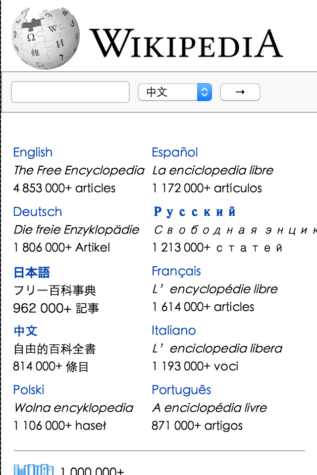
However, with the addition of CSS style sheets (and of course the viewport in the head), the page will be displayed perfectly on the mobile phone, like the image below:

A web page like the Wikipedia navigation page that is designed according to the computer layout, and then adds CSS to make it mobile-friendly, is desktop-first rather than mobile-first. Mobile first is just the opposite. The page is designed according to the mobile phone, and then it is adapted to the computer. The computer and the mobile phone also access the same page, which is mobile first. Since mobile-first websites are designed based on mobile phones, and since the release of the iPhone, many smartphones have also used cutting-edge browsers, so mobile-first websites will naturally use many new features in HTML5 and CSS3, greatly shortening the time required for a web page. development time. Moreover, mobile-first websites are designed for the high-latency network of mobile phones, reducing page size, and loading speed is greatly improved no matter what network environment you are in. The advantages of mobile-first are numerous, which is what led to its popularity.